City of Burnside
Council Rebrand
Council Rebrand
Brand Identity
Web Design
Wayfinding/Signage
Web Design
Wayfinding/Signage
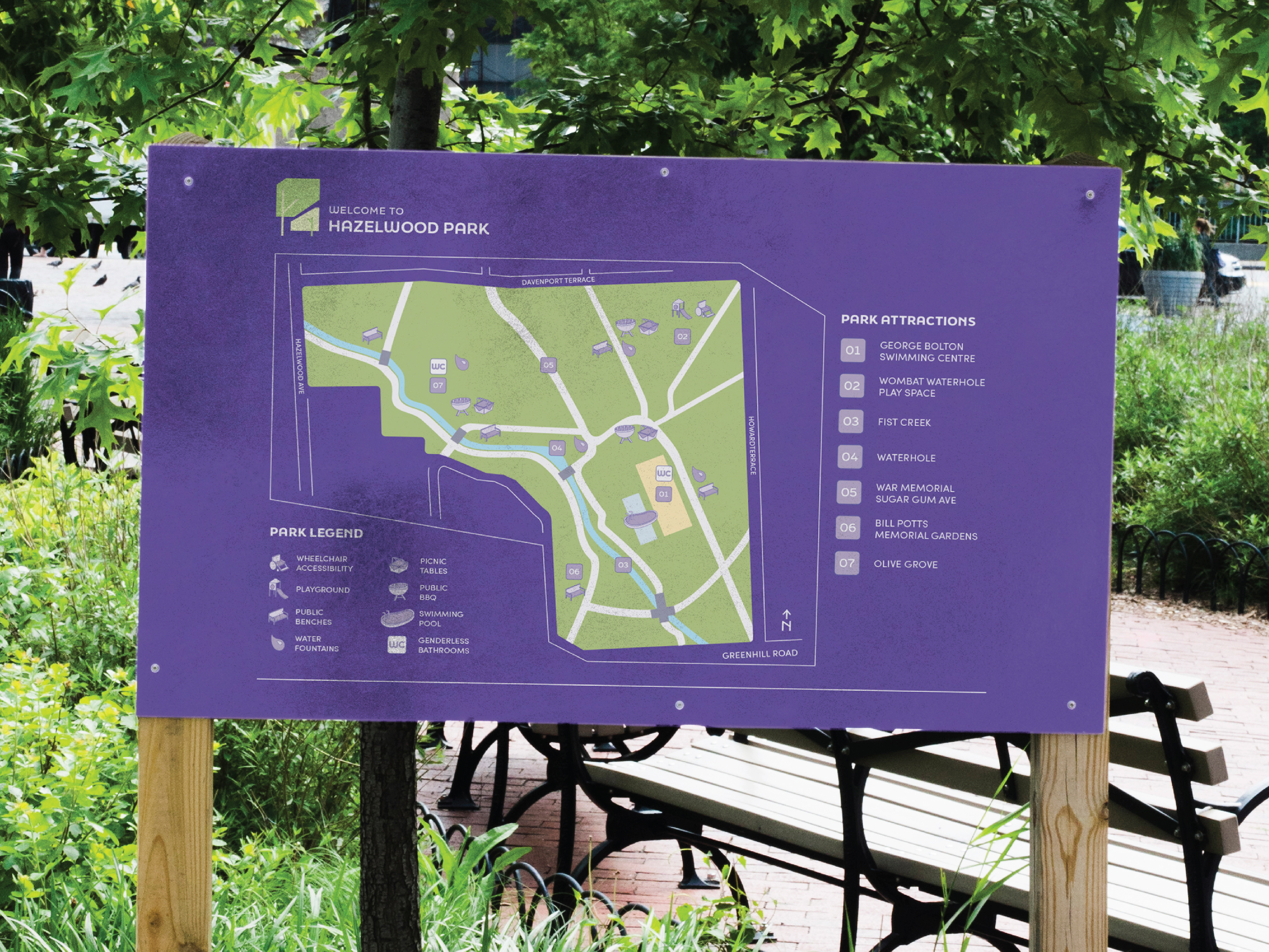
The City of Burnside has a reputation of being a 'rich' and almost exclusive community - but it is so much more than that. The aim of this project was to rebrand the city to appeal to a larger, more inclusive demographic, to not only appeal more people to visit, but to encourage existing residents to explore and experience other offerings Burnside has to offer - such as their lush parklands and stunning tree canopies.
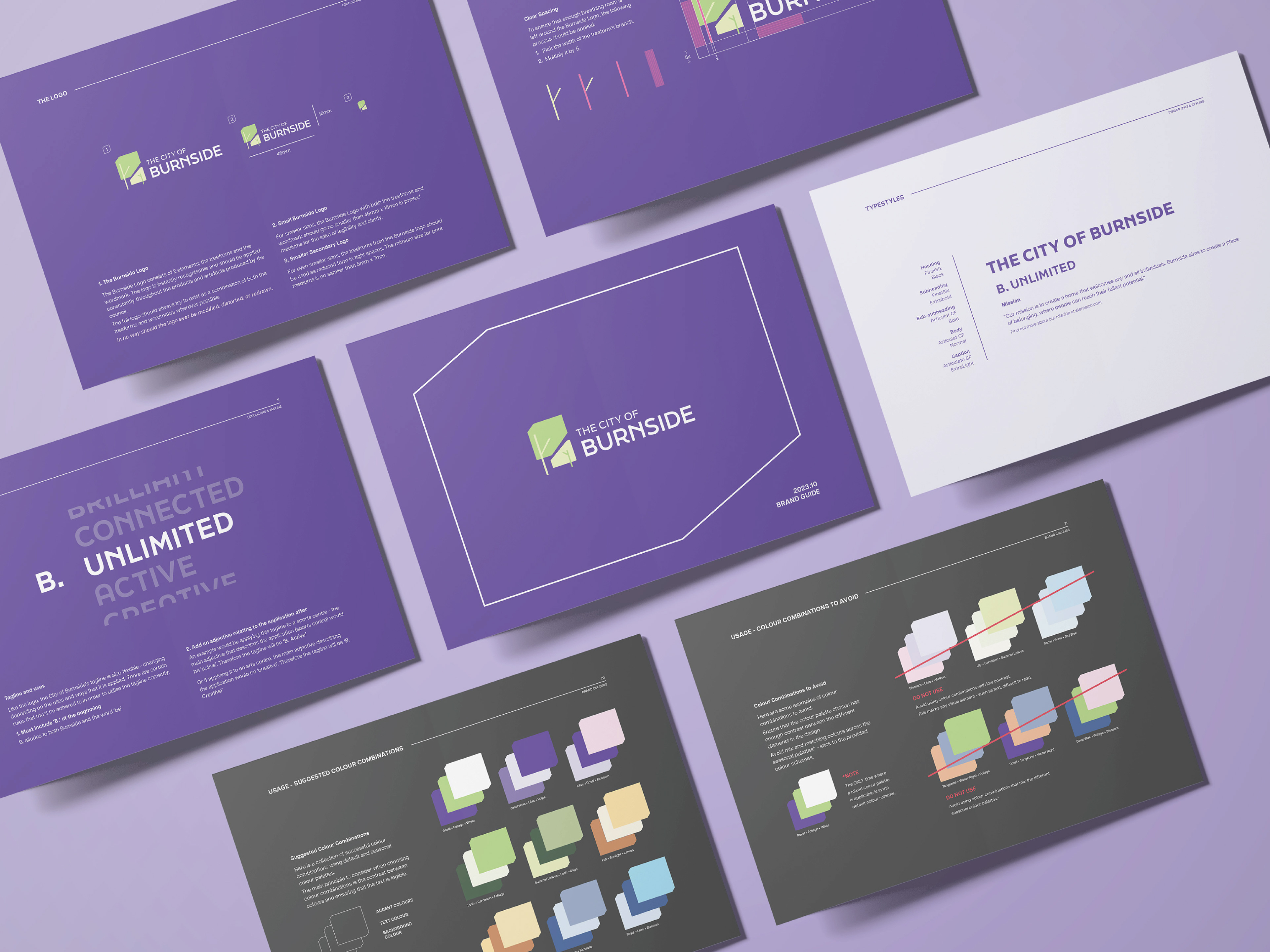
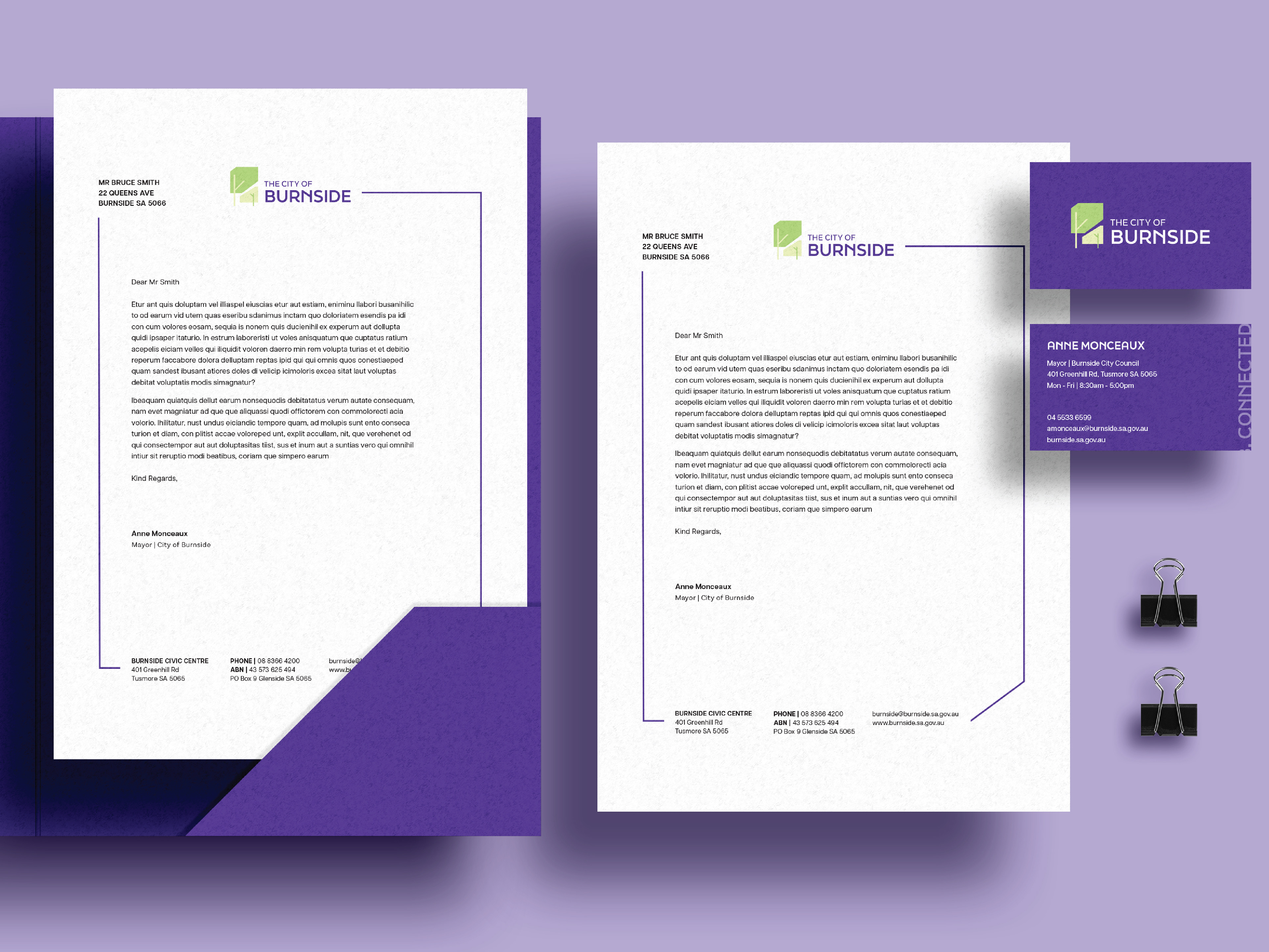
The new design for Burnside has several colour variations of their logo and brand to reflect the changing seasons and the treescape that reflects that seasonal change. The primary colours of the royal purple are synonymous with the luxurious nature of Burnside, but the redesigned logo has a friendlier and more approachable design to welcome a larger audience.
